COGNITION
Nothing creates a mystery quite like amnesia does for Sam Shepard. Those mysteries he he usually encounters would simply be the common nuisances of not having a memory, but now it's for reasons a whole lot darker. It's a murder mystery. On a cold winter morning, Sam awakens to find his house like it had been struck by a poltergeist - an upheaval left in the wake of an intruder who broke inside...and never made it out. Hearing from Sam through his diary reveals how this memory-stricken man isn't exactly the most innocent soul - he'd fondly operate on the thoughts of murdering as a means of testing his conscience, perhaps in the hope that he would rinse out some empathy if he rung hard enough. Now Sam is piecing together an idea of how a burglar broke inside his home and how he murdered him. Sam may have been warped for his thoughts of killing someone, but he'd never plan on truly committing. Well now he has.
THE SCREENPLAY
SHOT PLAN
ANCILLARY TASKS
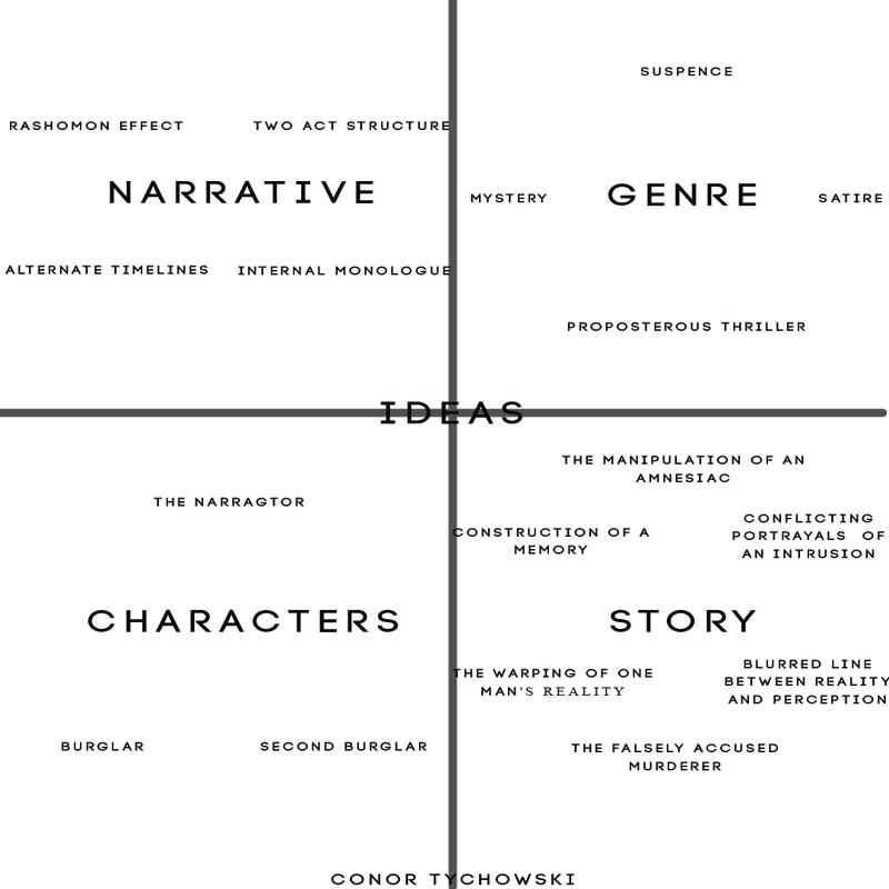
ORIGINAL IDEAS
JOB ROLES
FILM PITCH
AUDIENCE FEEDBACK
An early draft of our idea was pitched to a group of students aged 17-18. The purpose of our pitch was to obtain a reaction from our target audience and an idea of what people who were only enlightened to an outlined concept would envision for the rest of our picture.
Our feedback showed us that our audience was most drawn towards the intentional continuity mistakes, an idea that was thought of as being complex but original and smart if executed correctly. The only bias here is that this feedback was received from film-studies students who have a better understanding of the make-up of a film in comparison with a general audience.
A concern raised was the duration of our film which we then pitched to be around the 8-minute mark, our audience suggested this may force us to cram information into a short space of time. This feedback was took on board as we now look at our film as being around 15 minutes, our script is predicted to be from 15-20 pages therefore dialogue will be said quicker in order to prevent the need to sacrifice information. A second concern was the differentiation between visually seeing what was a memory sequence and what wasn't, this however will become very clear to the viewers as our memory sequences are a visualisation of diary entries, therefore the crosscutting between the two will clearly establish the level we are in.
The feedback showed an optimism regarding the potential of our concept, as long as we can remain within a refined and clear structure, our narrative will serve as one that is enticing for our viewers.
MOODBOARD
POSTER ANALYSIS
The three posters above are all rooted in the mystery genre and depict characters who are unfolding murder mysteries.
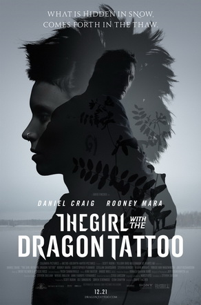
Girl with The Dragon Tattoo - This poster is the most modern example and is photographic as opposed to graphical. Two models feature in the poster, both of which are faded in translucency connoting their eventual rapport. The female is photographed in a profile shot,90 degrees to the camera inferring her as antisocial and disconnected, the male is portrayed with his back to camera though he is facing us deceitfully, like a man with secrets to hide, though perhaps confrontational with his demons. The colour palette is icy with the cold white juxtaposing the dark light cast across the actors faces.
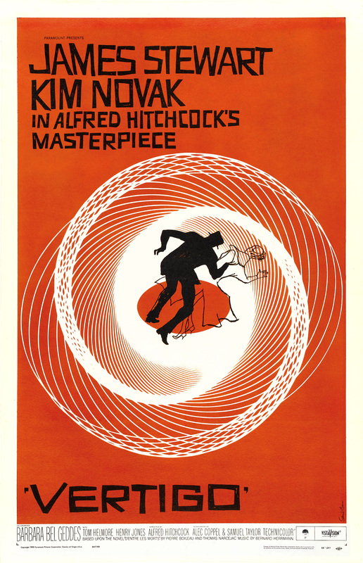
Vertigo - Vertigo is a graphical poster that depicts a man falling into a vortex in his dire efforts of following a woman. The concept of the poster is very simplistic though it depicts the film's plot, an acrophobic policeman gains a deadly obsession with a woman he is investigating, and thus spirals into a web of deceit and insanity. The colour red connotes both passion and danger, both of which are themes in Vertigo that entwine into a deadly pitfall - just as the poster suggests.
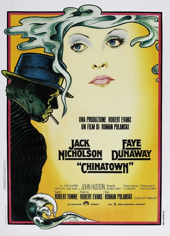
Chinatown - The poster is a graphical depiction of two characters - one of which is clouded in the other's cigarette smoke inferring an "air" of mystery surrounding the character. The film-noir style of the poster would suggest the woman is a femme fatale, especially as she's depicted above the detective connoting his lack of understanding reguarding the investigation - which is enhanced further by his literal casting in the darkness as opposed to the female character.
Girl with The Dragon Tattoo - This poster is the most modern example and is photographic as opposed to graphical. Two models feature in the poster, both of which are faded in translucency connoting their eventual rapport. The female is photographed in a profile shot,90 degrees to the camera inferring her as antisocial and disconnected, the male is portrayed with his back to camera though he is facing us deceitfully, like a man with secrets to hide, though perhaps confrontational with his demons. The colour palette is icy with the cold white juxtaposing the dark light cast across the actors faces.
Vertigo - Vertigo is a graphical poster that depicts a man falling into a vortex in his dire efforts of following a woman. The concept of the poster is very simplistic though it depicts the film's plot, an acrophobic policeman gains a deadly obsession with a woman he is investigating, and thus spirals into a web of deceit and insanity. The colour red connotes both passion and danger, both of which are themes in Vertigo that entwine into a deadly pitfall - just as the poster suggests.
Chinatown - The poster is a graphical depiction of two characters - one of which is clouded in the other's cigarette smoke inferring an "air" of mystery surrounding the character. The film-noir style of the poster would suggest the woman is a femme fatale, especially as she's depicted above the detective connoting his lack of understanding reguarding the investigation - which is enhanced further by his literal casting in the darkness as opposed to the female character.
COGNITION POSTER ART CONCEPT
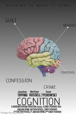
We produced a concept piece reguarding the poster of our film, this current poster is in no way the finished article but just an idea of what our poster will depict. Since our movie is firmly planted within the psychological thriller genre we wanted to show that as clearly as possible. A diagram of a brain is the subject of the poster in which it's lobes are labelled with words relating to the murder scene. Our film is about the study of amnesiacs mind and the way in which he vaguely confesses to a murder he committed.
The general characteristics of a poster are all present here, we have the title, credits, tagline and a clear subject of the poster. Audience feedback which focused on the colour scheme of the piece showed that audiences didn't take to the contrasting colour scheme, as the monochrome grey didn't work with the brightness of the brain, we ourselves agree with this as the poster was only formulated with Google images. A professional photoshopped version of this would be a lot more appealing to the eye. the pale colours of the brain wouldn't be present in the final piece, instead we aim to have our poster drenched in dread, no light colours on the poster so we infer the darkness of our protagonist's psyche.
The general characteristics of a poster are all present here, we have the title, credits, tagline and a clear subject of the poster. Audience feedback which focused on the colour scheme of the piece showed that audiences didn't take to the contrasting colour scheme, as the monochrome grey didn't work with the brightness of the brain, we ourselves agree with this as the poster was only formulated with Google images. A professional photoshopped version of this would be a lot more appealing to the eye. the pale colours of the brain wouldn't be present in the final piece, instead we aim to have our poster drenched in dread, no light colours on the poster so we infer the darkness of our protagonist's psyche.
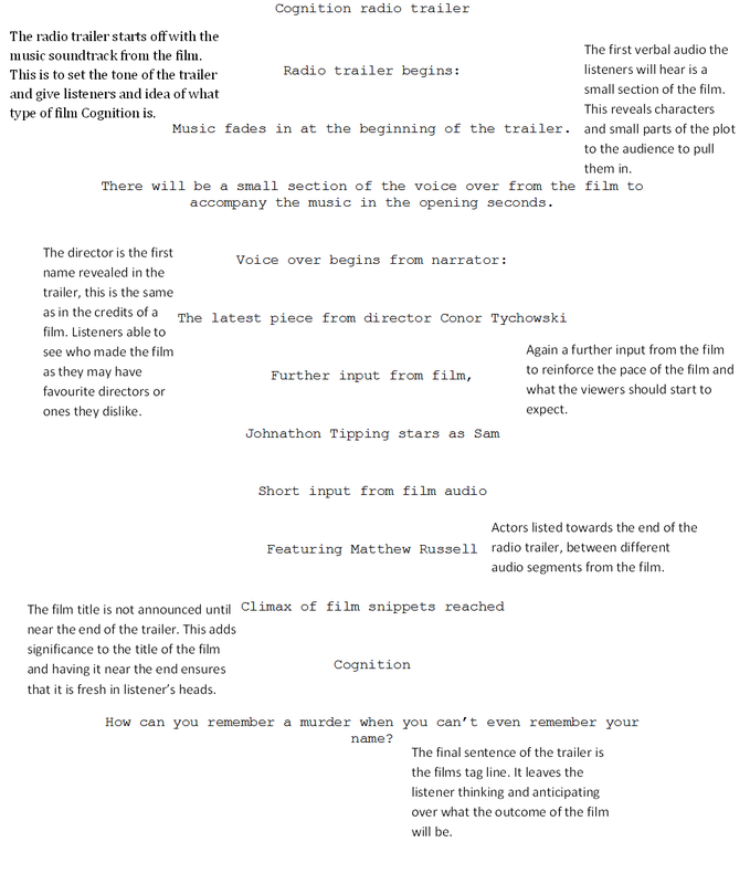
RADIO SCRIPT AND ANALYSIS
RISK ASSESSMENT
CONTINGENCY PLAN
PROP LIST
COSTUME PLAN
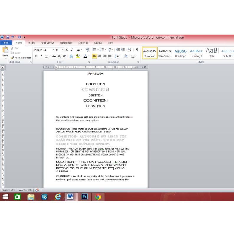
FONT STUDY
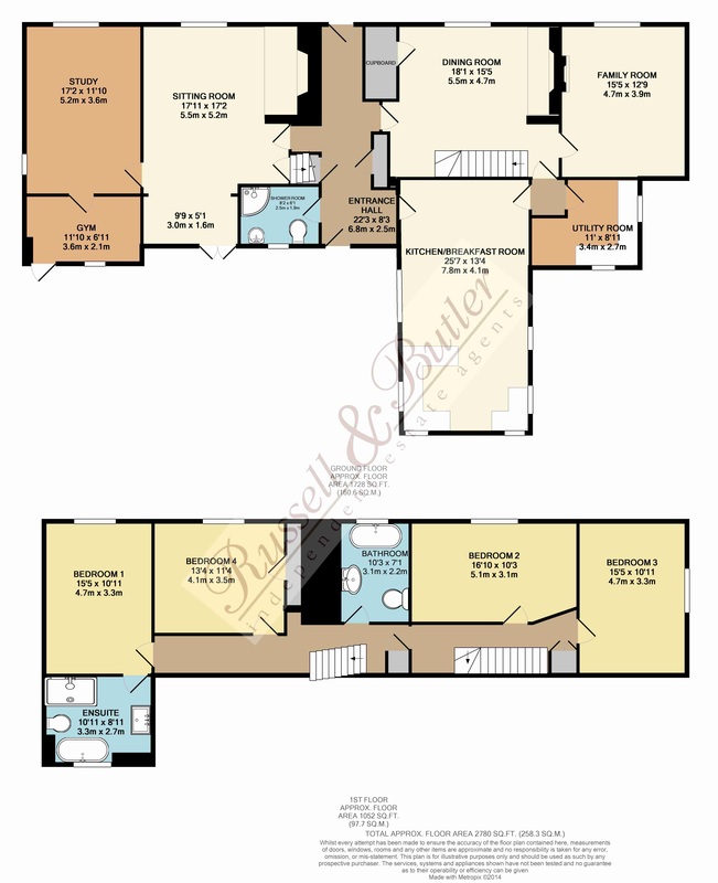
LOCATION PLAN
|
Kitchen/Breakfast Room
|
COLOUR PALETTE
|
Colour is one of the most subliminal yet powerful methods of creating an atmosphere. In photography and art design, colour is a key component in designing an aesthetic and portraying certain emptions . All colours are symbolic: Red may be passionate or angry, green represents nature, pink is a connotation to femininity etc.
In designing a colour pallet, a multitude of ideas are too be considered before a final product can be created. A colour scheme can be monotonous, which means that only shades of one colour are used - this is the simplest to create due it's self-complimentary design. On the opposite side of the spectrum, directly opposing colours are also easy to implement in a colour palette due to each colour visually enhancing it's opposite. The final common colour scheme is analogous which means that colours that are beside each other on the colour pallet are used creating a soft, blended image. |
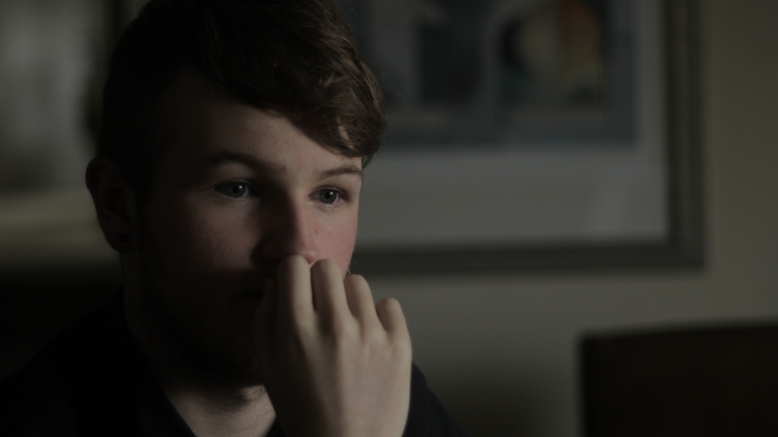
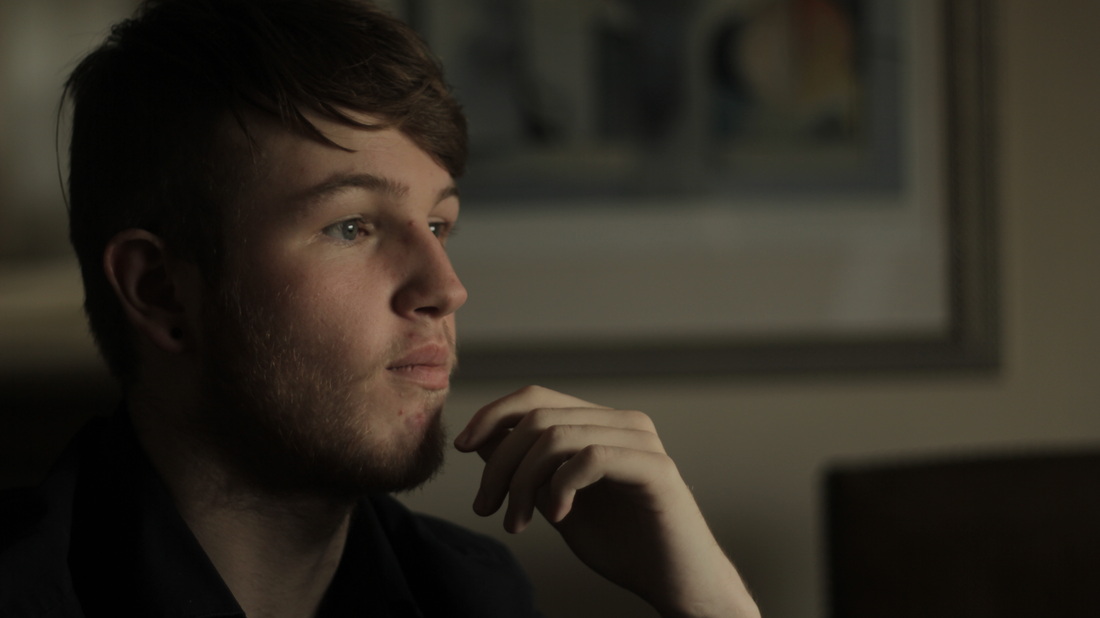
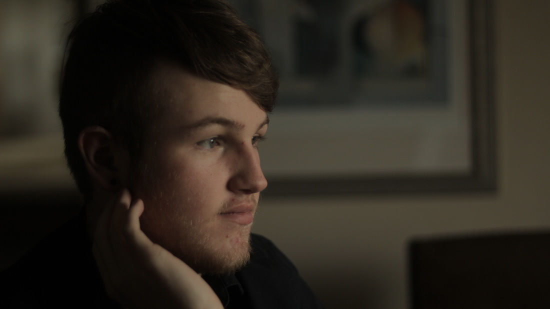
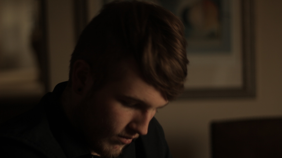
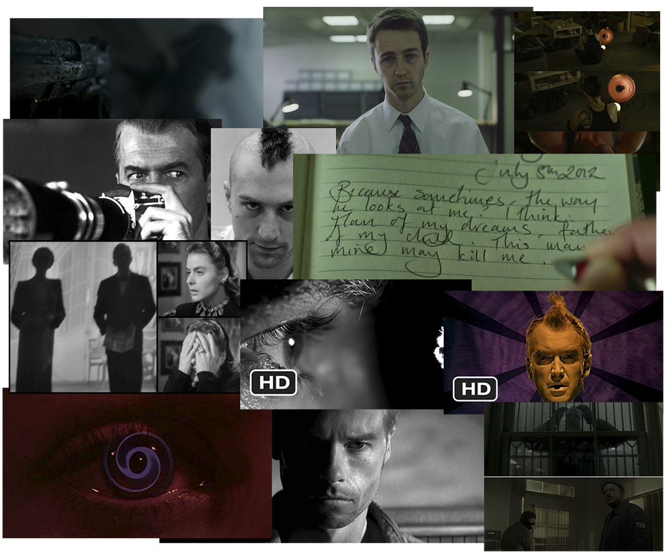
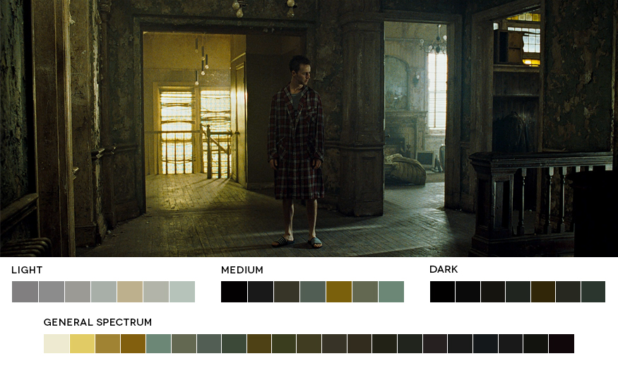
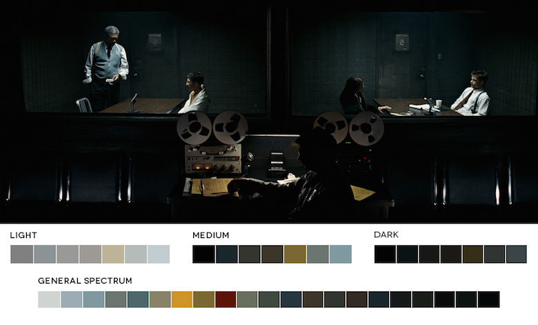
For our short film, we need to create a colour palette for our film that also works tonally and thematically. Despite framing being a key component of generating the colour palette, there are many other factors that can alter the look of an image. We carried out a lighting and colour test to achieve a style of cinematography that we will implement in our film. Out of the images above, the majority of our film will be photographed in the style of the top three images to create more of a bitter, icy atmosphere. The third shot on the top row has the most appealing colour scheme in our opinion and is dominated by one particular colour hew. We intend to light our film as realistically as possible using regular lamps and lights, although shadows may be cast in an an unorthodox style, ultimately what we'll be achieving is an image that looks authentic.
COLOUR PALETTE ANALYSIS
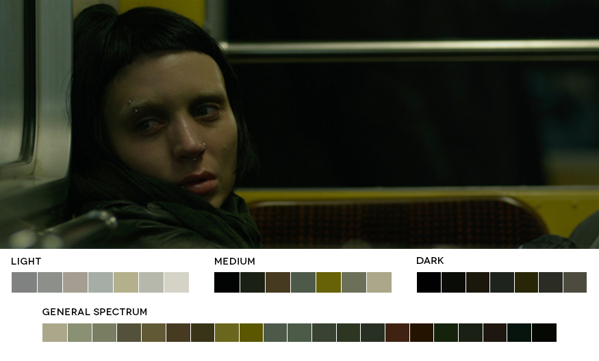
The Girl With The Dragon Tattoo is a clear example of how contrasting colour tones can shift our understanding of the scene. In the opening meeting between Mikael Blomkvist and Henrik Vanger, Blomkvist is briefed on the disappearance of Vanger's niece, the scene is void of saturation and life, just like Vanger in his lonesome, tired efforts at restoring faith in discovering his beloved niece. This scene is contrasted with flashbacks that are woven in as Vanger explains his memories of before his family dilapidated. These memories have a fondness, they are glowing with warmth just how Vanger remembers a more peaceful time. As the conversation progresses, and Blomkvist agrees to offer his investigative skills into the case, a glimmer of warmth seeps through into the stone cold imagery of present day. Even without sound we understand the point of view and tone of the scene.
Another brief sequence from this movie takes place in Lisbeth's apartment in which the camera technodollys over her shoulder as she sits on the floor cross-legged in a scene that was entitled 'Thinking Evil 'S**t". An impulsive alteration on set utilised a glaring heater that left a red hew over Lisbeth's face that intensifies her rage. Until this point, Lisbeth has always been depicted monotonous, shadowed with a skin-tone that of pale-haunted white, and strained of any emotional connection appearing more programmed as a hard-wired computer whiz than a person also capable of human interaction. This scene is the breakthrough for the audience in understanding the intentions of Lisbeth Salander, and the peeling away of the multiple layers of her character.
The Curious Case Of Benjamin Button uses a similarly saturated colour palette to differentiate between past and present. Colours are a heavily utilised tool in the biopic of Benjamin Button as we examine the journey of a man born as a decrepit old man who ages infantile until death. Told with a series of entwined flash-forwards and flash-backs from the perspective of Button's life-long lover, the past begins as a saturated vivid colour palette that drains into the monotonous cold blue of present day. The gradualism of natural light also impacts the colour tones, as Benjamin accompanies his father in witnessing his final dawn, the scene morphs atmospherically as he gazes across the ocean, beginning as a drained bitter morning and ending as a festival of life. The sunrise ascends illuminating his face in epiphany as he finally welcomes the inevitably of death. facing the end of his days with a fiery final breath.
